Proper
Specialty coffee has become an exercise in precision. From carefully sourced beans and considered roast profiles to the nuances of extraction, every detail contributes to the final cup. Yet when it comes to syrup, the same level of consideration is rarely applied. Proper was founded to change that.
We partnered with the team to create a brand that brought a fresh perspective to an otherwise overlooked category. The ambition was to move away from the ornate, traditional visual language of conventional syrups and create something more in tune with the contemporary coffee world.
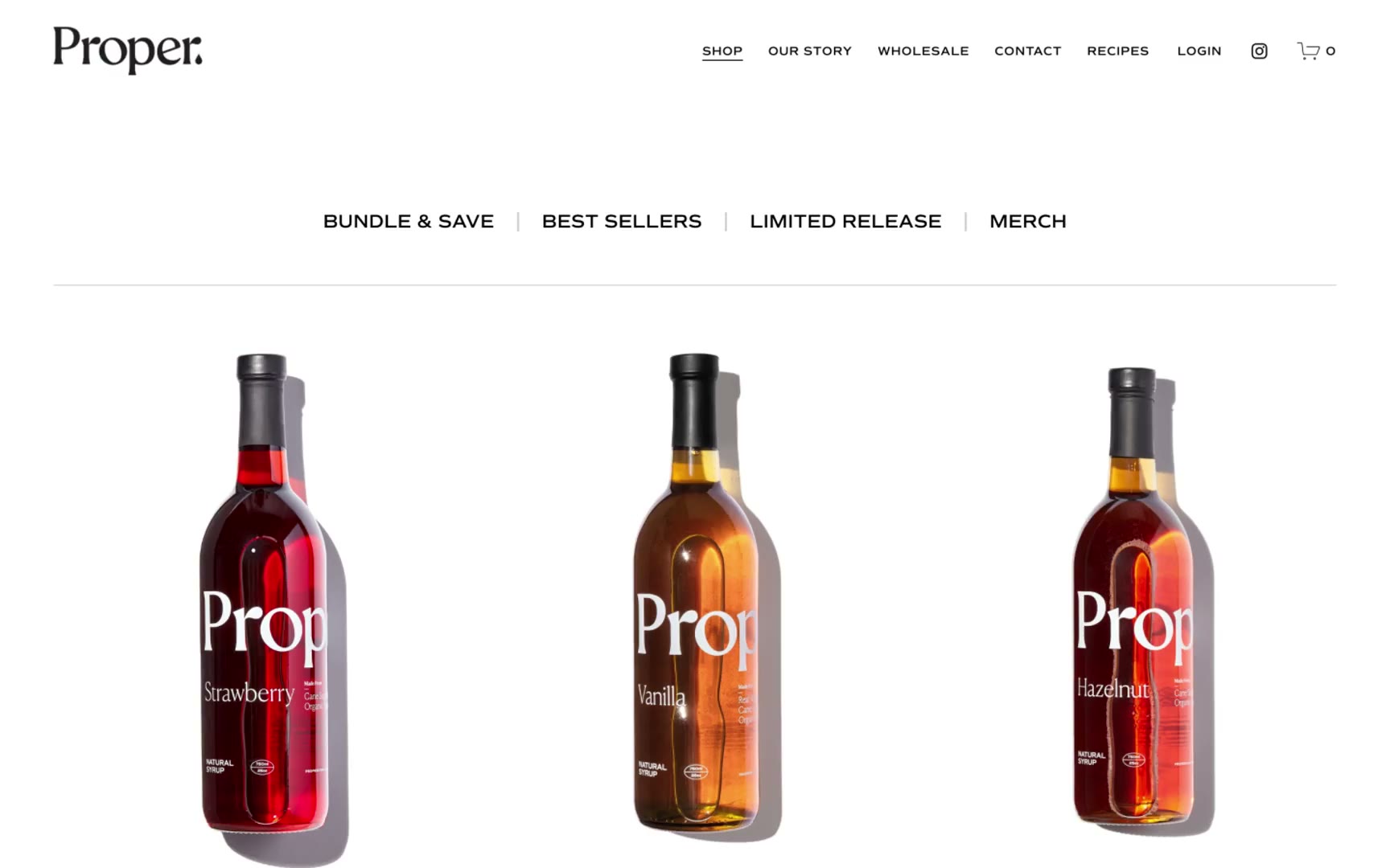
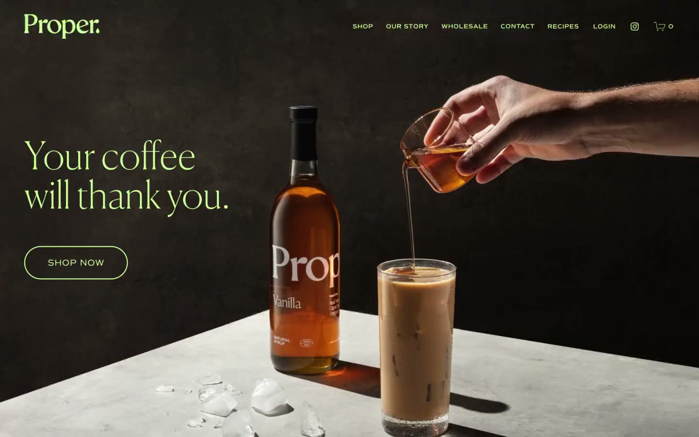
The resulting identity takes a more confident and pared-back approach. Bold typography, distinctive graphic elements and a considered colour system give Proper a strong shelf presence, while a cohesive packaging language brings consistency across the growing product range.
The thinking extends beyond aesthetics. From the outset, the brand needed to work just as naturally in independent coffee shops as it would on the shelves of major retailers. Now sold Target nationwide, we think Proper is well on it’s way to setting a new standard in syrup.
Services
Strategy Naming Visual Identity Brand Guidelines Art Direction Packaging Print Design Website UI/UX
Seen in
Target Chamberlain Coffee Blank Street Crate & Barrel Times Square