Amo
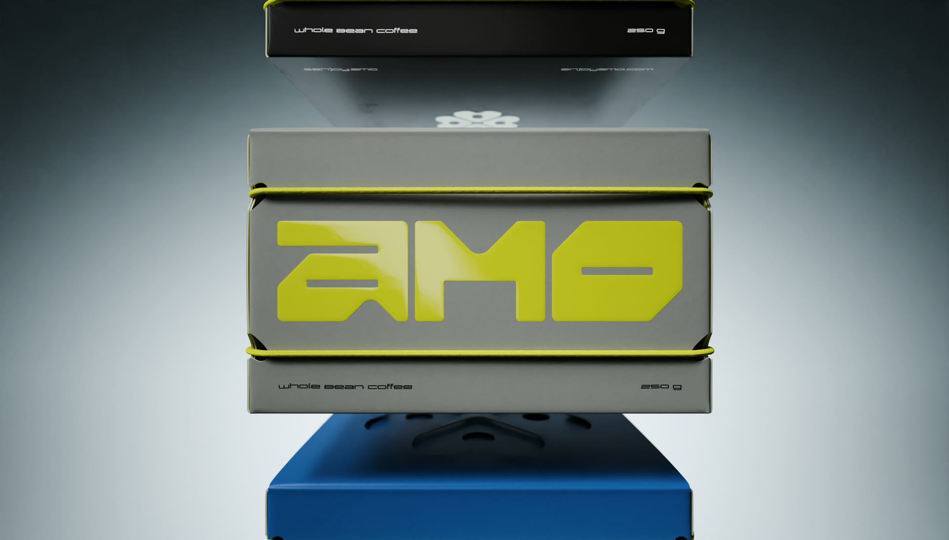
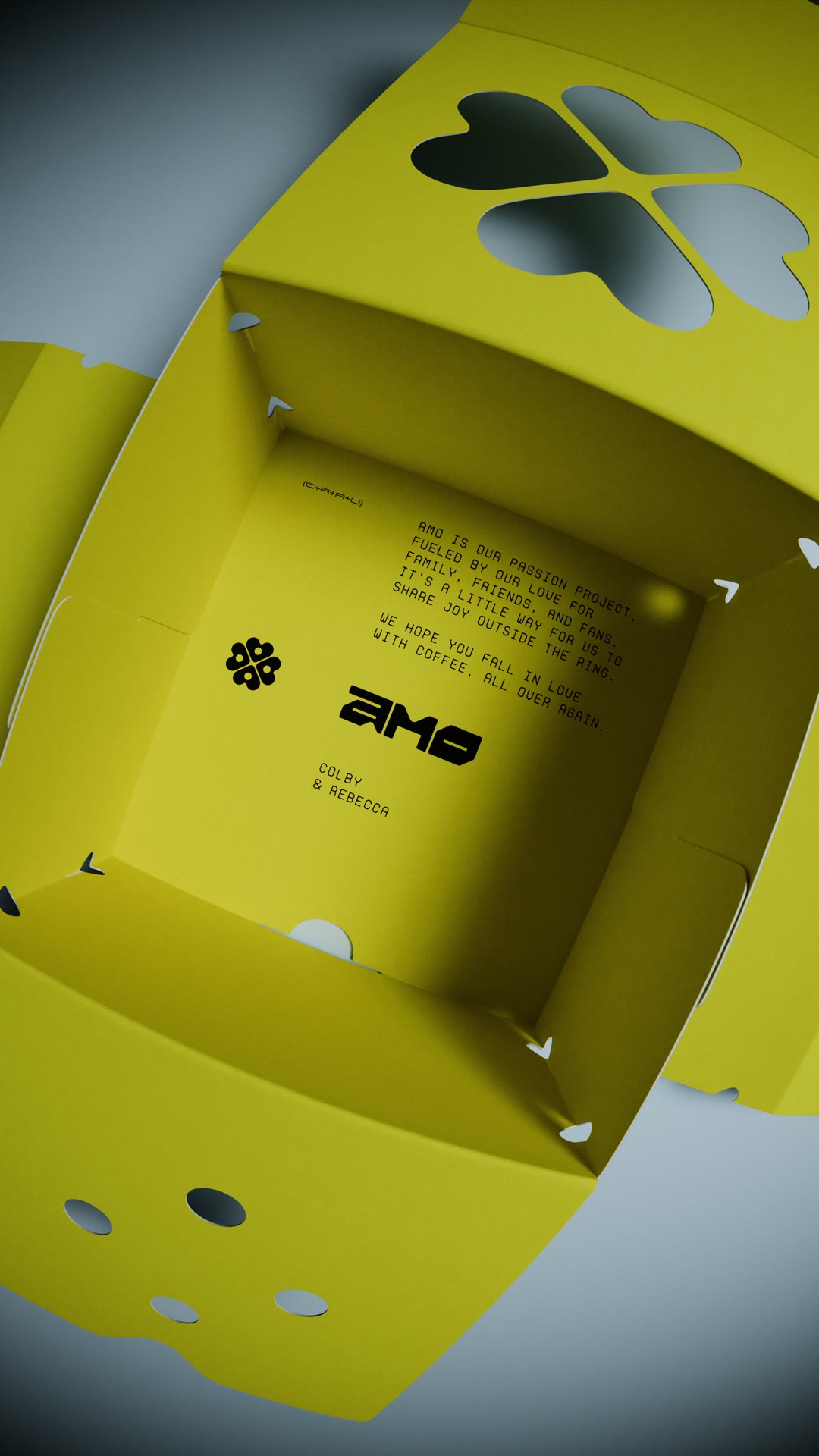
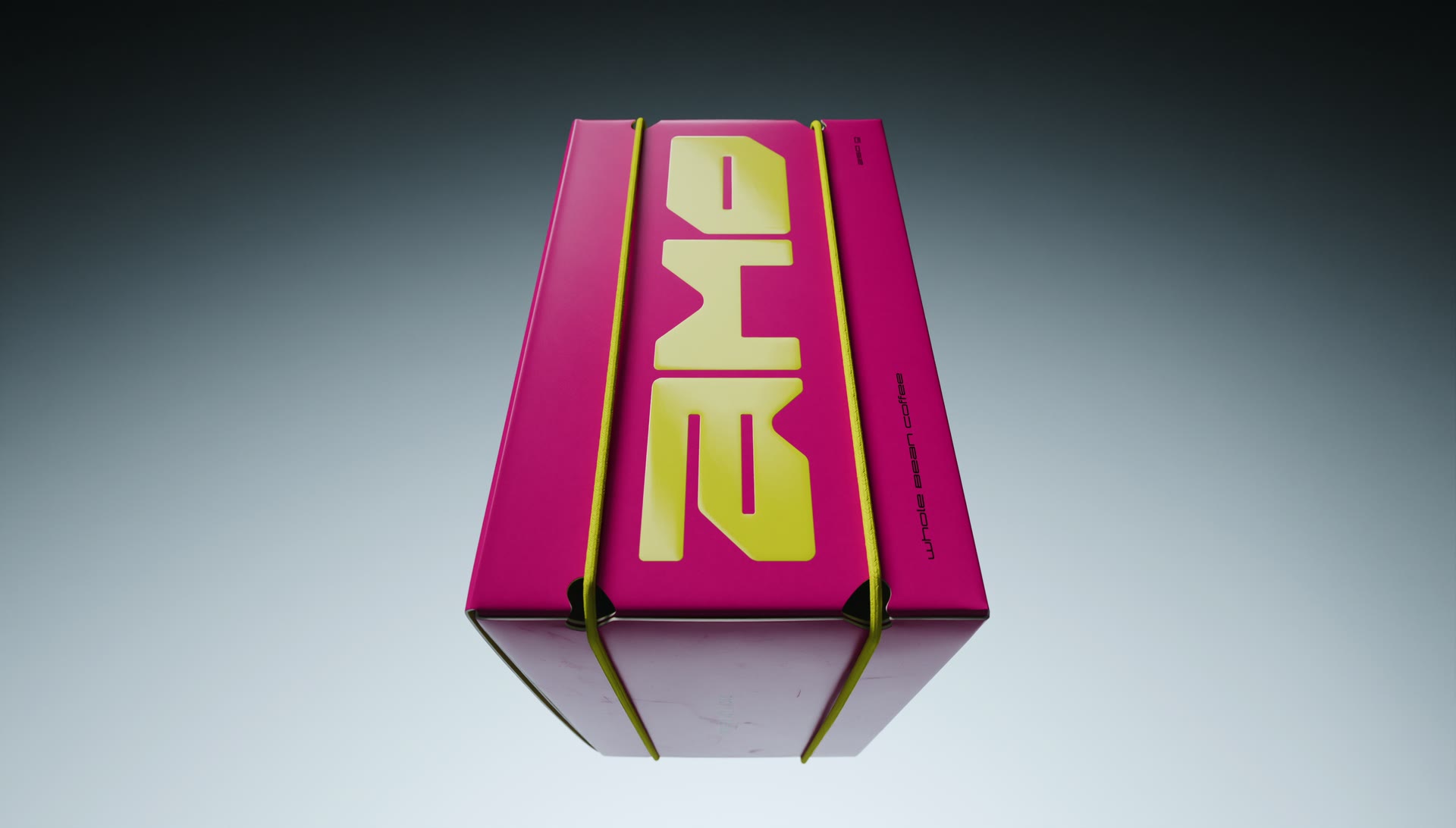
Colby Lopez and Rebecca Quin fell in love with a cup of coffee between them. AMO is the culmination of years spent traveling the world and exploring coffee together. Born from a simple love for coffee, this passion project was birthed as a way to share joy outside the ring.
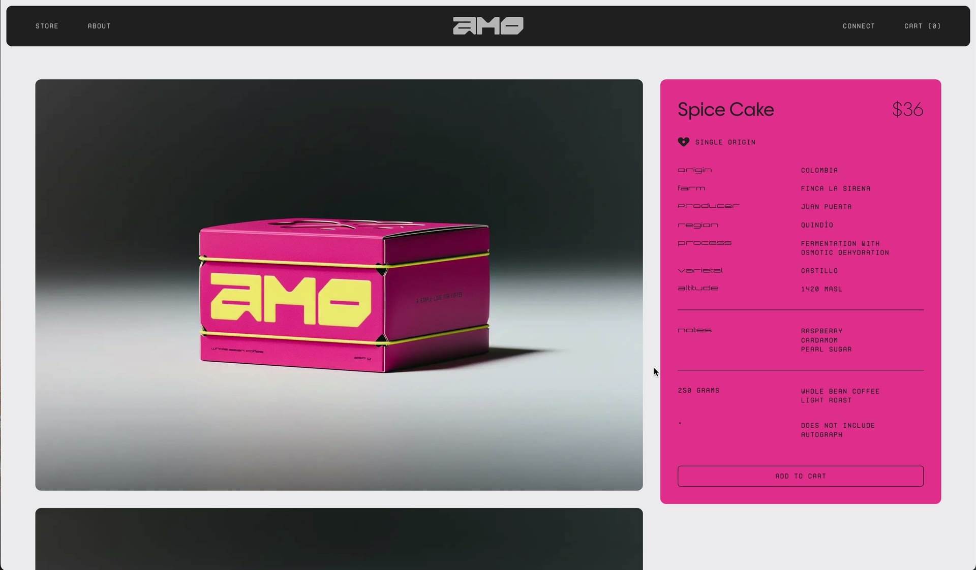
Ultimately, the goal was to create a brand that felt energetic, memorable, and collectible, inviting both coffee enthusiasts and wrestling fans into the world of Amo.
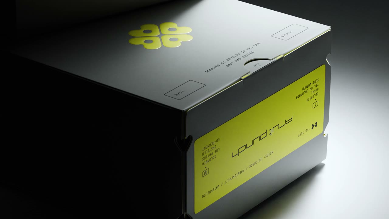
The logomark itself forms a gold four-leaf clover, composed of four hearts. Rebecca hails from Ireland, where the clover is a symbol of rarity and love. For these two champion wrestlers, love is the greatest gold. As a playful nod to the founders, the logo even hides a subtle equation: C + LOVE + R = CLOVER = AMO.
Services
Strategy Naming Visual Identity Brand Guidelines Art Direction Packaging Print Design Website UI/UX Spatial Design 3D Renders